ВУЗ: Не указан
Категория: Не указан
Дисциплина: Не указана
Добавлен: 17.04.2021
Просмотров: 3745
Скачиваний: 3

Introduction to Python for Science, Release 0.9.23
plot(x, y)
where
x
and
y
are arrays (or lists) that have the same size. If the
x
array is missing, that
is, if there is only a single array, as in our example above, the
plot
function uses
0, 1,
..., N-1
for the
x
array, where
N
is the size of the
y
array. Thus, the
plot
function
provides a quick graphical way of examining a data set.
More typically, you supply both an
x
and a
y
data set to plot. Taking things a bit further,
you may also want to plot several data sets on the same graph, use symbols as well as
lines, label the axes, create a title and a legend, and control the color of symbols and lines.
All of this is possible but requires calling a number of plotting functions. For this reason,
plotting is usually done using a Python script or program.
5.2 Basic plotting
The quickest way to learn how to plot using the MatPlotLib library is by example. For
our first task, let’s plot the sine function over the interval from 0 to
4
π
. The main plotting
function
plot
in MatPlotLib does not plot functions
per se
, it plots
(
x, y
)
data points.
As we shall see, we can instruct the function
plot
either to just draw point—or dots—
at each data point, or we can instruct it to draw straight lines between the data points.
To create the illusion of the smooth function that the sine function is, we need to create
enough
(
x, y
)
data points so that when
plot
draws straight lines between the data points,
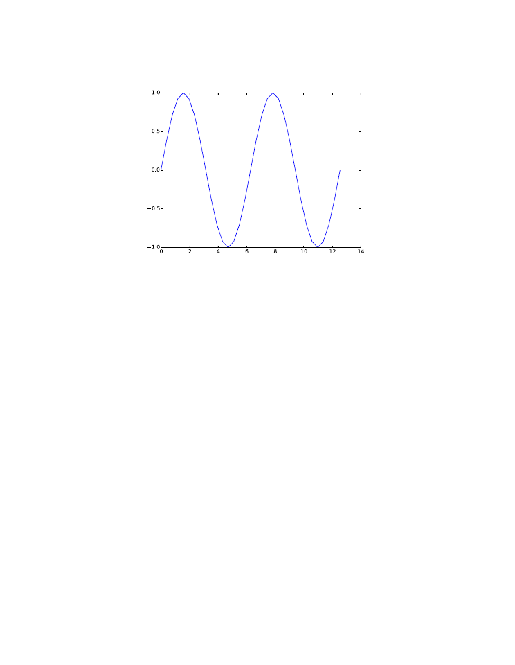
the function appears to be smooth. The sine function undergoes two full oscillations with
two maxima and two minima between 0 and
4
π
. So let’s start by creating an array with
33 data points between 0 and
4
π
, and then let MatPlotLib draw a straight line between
them. Our code consists of four parts
• import the NumPy and MatPlotLib modules (lines 1-2 below)
• create the
(
x, y
)
data arrays (lines 3-4 below)
• have
plot
draw straight lines between the
(
x, y
)
data points (line 5 below)
• display the plot in a figure window using the
show
function (line 6 below)
Here is our code, which consists of only 6 lines:
1
import
numpy
as
np
2
import
matplotlib.pyplot
as
plt
3
x
=
np
.
linspace(
0
,
4.
*
np
.
pi,
33
)
4
y
=
np
.
sin(x)
5
plt
.
plot(x, y)
6
plt
.
show()
5.2. Basic plotting
75
Introduction to Python for Science, Release 0.9.23
Figure 5.2: Sine function
Only 6 lines suffice to create the plot, which consists of the sine function over the interval
from 0 to
4
π
, as advertised, as well as axes annotated with nice whole numbers over the
appropriate interval. It’s a pretty nice plot made with very little code.
One problem, however, is that while the plot oscillates like a sine wave, it is not smooth.
This is because we did not create the
(
x, y
)
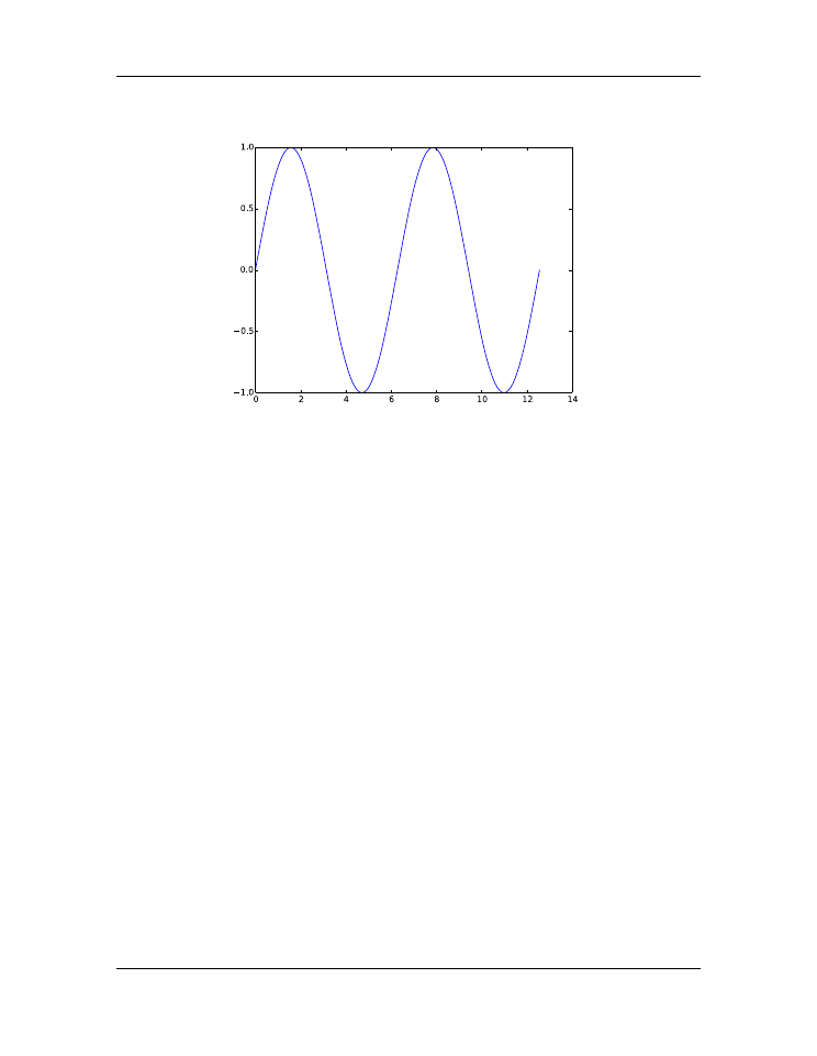
arrays with enough data points. To correct
this, we need more data points. The plot below was created using the same program
shown above but with 129
(
x, y
)
data points instead of 33. Try it out your self by copying
the above program and replacing 33 in line 3 with 129 so that the function
linspace
creates an array with 129 data points instead of 33.
The code above illustrates how plots can be made with very little code using the Mat-
PlotLib module. In making this plot, MatPlotLib has made a number of choices, such as
the size of the figure, the blue color of the line, even the fact that by default a line is drawn
between successive data points in the
(
x, y
)
arrays. All of these choices can be changed
by explicitly instructing MatPlotLib to do so. This involves including more arguments
in the function calls we have used and using new functions that control other properties
of the plot. The next example illustrates a few of the simpler embellishments that are
possible.
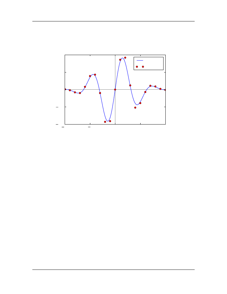
In the
figure, we plot two
(
x, y
)
data sets: a smooth line curve and some data
represented by red circles. In this plot, we label the
x
and
y
axes, create a legend, and
draw lines to indicate where
x
and
y
are zero. The code that creates this plot is shown
below.
76
Chapter 5. Plotting
Introduction to Python for Science, Release 0.9.23
Figure 5.3: Sine function plotted using more data points
1
import
numpy
as
np
2
import
matplotlib.pyplot
as
plt
3
4
# read data from file
5
xdata, ydata
=
np
.
loadtxt(
’wavePulseData.txt’
, unpack
=
True
)
6
7
# create x and y arrays for theory
8
x
=
np
.
linspace(
-
10.
,
10.
,
200
)
9
y
=
np
.
sin(x)
*
np
.
exp(
-
(x
/
5.0
)
**
2
)
10
11
# create plot
12
plt
.
figure(
1
, figsize
=
(
6
,
4
) )
13
plt
.
plot(x, y,
’b-’
, label
=
’theory’
)
14
plt
.
plot(xdata, ydata,
’ro’
, label
=
"data"
)
15
plt
.
xlabel(
’x’
)
16
plt
.
ylabel(
’transverse displacement’
)
17
plt
.
legend(loc
=
’upper right’
)
18
plt
.
axhline(color
=
’gray’
, zorder
=-
1
)
19
plt
.
axvline(color
=
’gray’
, zorder
=-
1
)
20
21
# save plot to file
22
plt
.
savefig(
’WavyPulse.pdf’
)
23
24
# display plot on screen
5.2. Basic plotting
77
Introduction to Python for Science, Release 0.9.23
25
plt
.
show()
10
5
0
5
10
x
1.0
0.5
0.0
0.5
1.0
transverse displacement
theory
data
Figure 5.4: Wavy pulse
If you have read the first four chapters, the code in lines 1-9 in the above script should be
familiar to you. Fist, the script loads the NumPy and MatPlotLib modules, then reads data
from a data file into two arrays,
xdata
and
ydata
, and then creates two more arrays,
x
and
y
. The first pair or arrays,
xdata
and
ydata
, contain the
x
-
y
data that are plotted
as red circles in the
figure; the arrays created in line 8 and 9 contain the
x
-
y
data that are plotted as a blue line.
The functions that do the plotting begin on line 12. Let’s go through them one by one
and see what they do. You will notice in several cases that
keyword arguments
(
kwargs
)
are used in several cases. Keyword arguments are
optional
arguments that have the form
kwarg=
data
, where
data
might be a number, a string, a tuple, or some other form of
data.
figure()
creates a blank figure window. If it has no arguments, it creates
a window that is 8 inches wide and 6 inches high by default, although
the size that appears on your computer depends on your screen’s res-
olution. For most computers, it will be much smaller. You can create
a window whose size differs from the default using the optional key-
word argument
figsize
, as we have done here. If you use
figsize
,
set it equal to a 2-element tuple where the elements are the width and
height, respectively, of the plot. Multiple calls to
figure()
opens
78
Chapter 5. Plotting

Introduction to Python for Science, Release 0.9.23
multiple windows:
figure(1)
opens up one window for plotting,
figure(2)
another, and
figure(3)
yet another.
plot(x, y,
optional arguments
)
graphs the
x
-
y
data in the arrays
x
and
y
. The third argument is a format string that specifies the color
and the type of line or symbol that is used to plot the data. The string
’ro’
specifies a red (
r
) circle (
o
). The string
’b-’
specifies a blue
(
b
) solid line (
-
). The keyword argument
label
is set equal to a string
that labels the data if the
legend
function is called subsequently.
xlabel(
string
)
takes a string argument that specifies the label for the
graph’s
x
-axis.
ylabel(
string
)
takes a string argument that specifies the label for the
graph’s
y
-axis.
legend()
makes a legend for the data plotted. Each
x
-
y
data set is labeled
using the string that was supplied by the
label
keyword in the
plot
function that graphed the data set. The
loc
keyword argument specifies
the location of the legend.
axhline()
draws a horizontal line across the width of the plot at
y=0
.
The optional keyword argument
color
is a string that specifies the
color of the line. The default color is black. The optional keyword ar-
gument
zorder
is an integer that specifies which plotting elements are
in front of or behind others. By default, new plotting elements appear
on top of
previously plotted elements and have a value of
zorder=0
.
By specifying
zorder=-1
, the horizontal line is plotted
behind
all ex-
isting plot elements that have not be assigned an explicit
zorder
less
than -1.
axvline()
draws a vertical line from the top to the bottom of the plot at
x=0
. See
axhline()
for explanation of the arguments.
savefig(
string
)
saves the figure to data data file with a name specified
by the string argument. The string argument can also contain path infor-
mation if you want to save the file so some place other than the default
directory.
show()
displays the plot on the computer screen. No screen output is pro-
duced before this function is called.
To plot the solid blue line, the code uses the
’b-’
format specifier in the
plot
func-
tion call. It is important to understand that MatPlotLib draws
straight lines
between data
points. Therefore, the curve will appear smooth only if the data in the NumPy arrays
are sufficiently dense. If the space between data points is too large, the straight lines the
5.2. Basic plotting
79