ВУЗ: Не указан
Категория: Не указан
Дисциплина: Не указана
Добавлен: 17.04.2021
Просмотров: 3752
Скачиваний: 3
Introduction to Python for Science, Release 0.9.23
plot
function draws between data points will be visible. For plotting a typical function,
something on the order of 100-200 data points usually produces a smooth curve, depend-
ing on just how curvy the function is. On the other hand, only two points are required to
draw a smooth straight line.
Detailed information about the MatPlotLib plotting functions are available online, starting
with the site
http://matplotlib.org/api/pyplot_summary.html
. The main MatPlotLib site is
5.2.1 Specifying line and symbol types and colors
In the above example, we illustrated how to draw one line type (solid), one symbol type
(circle), and two colors (blue and red). There are many more possibilities, which are
specified in the tables below. The way it works is to specify a string consisting of one or
more plotting format specifiers. There are two types of format specifiers, one for the line
or symbol type and another for the color. It does not matter in which order the format
specifiers are listed in the string. Examples are given following the two tables. Try them
out to make sure you understand how these plotting format specifiers work.
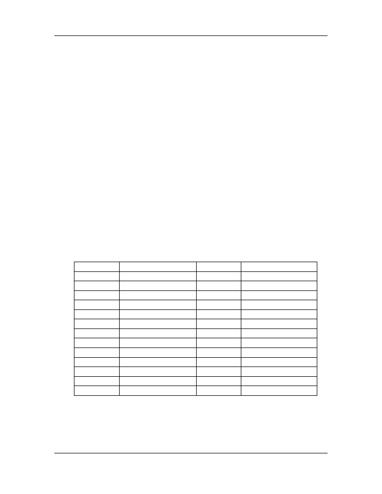
The first table below shows the characters used to specify the line or symbol type that is
used. If a line type is chosen, the lines are drawn between the data points. If a marker
type is chosen, the a marker is plotted at each data point.
character
description
character
description
-
solid line style
3
tri_left marker
--
dashed line style
4
tri_right marker
-.
dash-dot line style
s
square marker
:
dotted line style
p
pentagon marker
.
point marker
*
star marker
,
pixel marker
h
hexagon1 marker
o
circle marker
H
hexagon2 marker
v
triangle_down marker
+
plus marker
^
triangle_up marker
x
x marker
<
triangle_left marker
D
diamond marker
>
triangle_right marker
d
thin_diamond marker
1
tri_down marker
|
vline marker
2
tri_up marker
_
hline marker
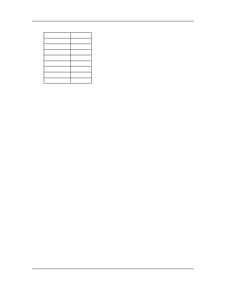
This second table gives the character codes for eight different colors. Many more are
possible but the color specification becomes more complex. You can consult the web-
based MatPlotLib documentation for further details.
80
Chapter 5. Plotting
Introduction to Python for Science, Release 0.9.23
character
color
b
blue
g
green
r
red
c
cyan
m
magenta
y
yellow
k
black
w
white
Here are some examples of how these format specifiers can be used:
plot(x, y,
’ro’
)
# plots red circles
plot(x, y,
’ks-’
)
# plot black squares connected by black lines
plot(x, y,
’g^’
)
# plots green triangles that point up
plot(x, y,
’k-’
)
# plots a black line between the points
plot(x, y,
’ms’
)
# plots magenta squares
You can also make two calls sequentially for added versatility. For example, by sequen-
tially calling the last two plot calls, the plot produces magenta squares on top of black
lines connecting the data points.
These format specifiers give rudimentary control of the plotting symbols and lines. Mat-
PlotLib provides much more precise and detailed control of the plotting symbol size, line
types, and colors using optional keyword arguments instead of the plotting format strings
introduced above. For example, the following command creates a plot of large yellow
diamond symbols with blue edges connected by a green dashed line:
plot(x, y, color
=
’green’
, linestyle
=
’dashed’
, marker
=
’d’
,
markerfacecolor
=
’yellow’
, markersize
=
12
,
markeredgecolor
=
’blue’
)
Try it out! The online MatPlotLib documentation provides all the plotting format keyword
arguments and their possible values.
5.2.2 Error bars
When plotting experimental data it is customary to include error bars that indicate graph-
ically the degree of uncertainty that exists in the measurement of each data point. The
MatPlotLib function
errorbar
plots data with error bars attached. It can be used in
a way that either replaces or augments the
plot
function. Both vertical and horizontal
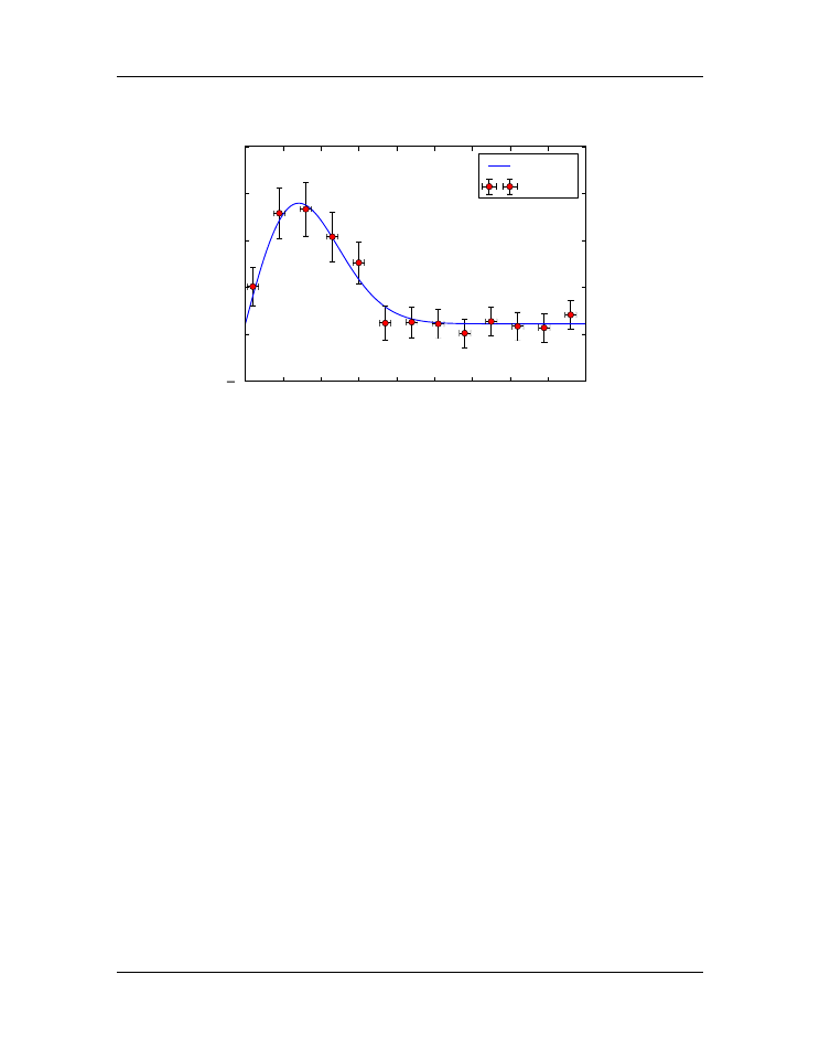
error bars can be displayed. The figure below illustrates the use of error bars.
5.2. Basic plotting
81
Introduction to Python for Science, Release 0.9.23
0
5
10 15 20 25 30 35 40 45
x
5
0
5
10
15
20
transverse displacement
theory
data
Figure 5.5: Error Bars
When error bars are desired, you typically replace the
plot
function with the
errorbar
function. The first two arguments of the
errorbar
function are the
x
and
y
arrays to
be plotted, just as for the
plot
function. The keyword
fmt
must be used
to specify the
format of the points to be plotted; the format specifiers are the same as for
plot
. The
keywords
xerr
and
yerr
are used to specify the
x
and
y
error bars. Setting one or both
of them to a constant specifies one size for all the error bars. Alternatively, setting one or
both of them equal to an array that has the same length as the
x
and
y
arrays allows you
to give each data point an error bar with a different value. If you only want
y
error bars,
then you should only specify the
yerr
keyword and omit the
xerr
keyword. The color
of the error bars is set with the keyword
ecolor
.
The code and plot below illustrates how to make error bars and was used to make the
above plot. Lines 14 and 15 contain the call to the
errorbar
function. The
x
error
bars are all set to a constant value of 0.75, meaning that the error bars extend 0.75 to the
left and 0.75 to the right of each data point. The
y
error bars are set equal to an array,
which was read in from the data file containing the data to be plotted, so each data point
has a different
y
error bar. By the way, leaving out the
xerr
keyword argument in the
errorbar
function call below would mean that only the
y
error bars would be plotted.
1
import
numpy
as
np
2
import
matplotlib.pyplot
as
plt
3
4
# read data from file
5
xdata, ydata, yerror
=
np
.
loadtxt(
’expDecayData.txt’
, unpack
=
True
)
82
Chapter 5. Plotting

Introduction to Python for Science, Release 0.9.23
6
7
# create theoretical fitting curve
8
x
=
np
.
linspace(
0
,
45
,
128
)
9
y
=
1.1
+
3.0
*
x
*
np
.
exp(
-
(x
/
10.0
)
**
2
)
10
11
# create plot
12
plt
.
figure(
1
, figsize
=
(
6
,
4
) )
13
plt
.
plot(x, y,
’b-’
, label
=
"theory"
)
14
plt
.
errorbar(xdata, ydata, fmt
=
’ro’
, label
=
"data"
,
15
xerr
=
0.75
, yerr
=
yerror, ecolor
=
’black’
)
16
plt
.
xlabel(
’x’
)
17
plt
.
ylabel(
’transverse displacement’
)
18
plt
.
legend(loc
=
’upper right’
)
19
20
# save plot to file
21
plt
.
savefig(
’ExpDecay.pdf’
)
22
23
# display plot on screen
24
plt
.
show()
We have more to say about the
errorbar
function in the sections on logarithmic plots.
But the brief introduction given here should suffice for making most plots not involving
logarithmic axes.
5.2.3 Setting plotting limits and excluding data
It turns out that you often want to restrict the range of numerical values over which you
plot data or functions. In these cases you may need to manually specify the plotting
window or, alternatively, you may wish to exclude data points that are outside some set
of limits. Here we demonstrate methods for doing this.
Setting plotting limits
Suppose you want to plot the tangent function over the interval from 0 to 10. The follow-
ing script offers an straightforward first attempt.
import
numpy
as
np
import
matplotlib.pyplot
as
plt
theta
=
np
.
arange(
0.01
,
10.
,
0.04
)
ytan
=
np
.
tan(theta)
5.2. Basic plotting
83
Introduction to Python for Science, Release 0.9.23
plt
.
figure()
plt
.
plot(theta, ytan)
plt
.
show()
0
2
4
6
8
10
200
0
200
400
600
800
1000
1200
1400
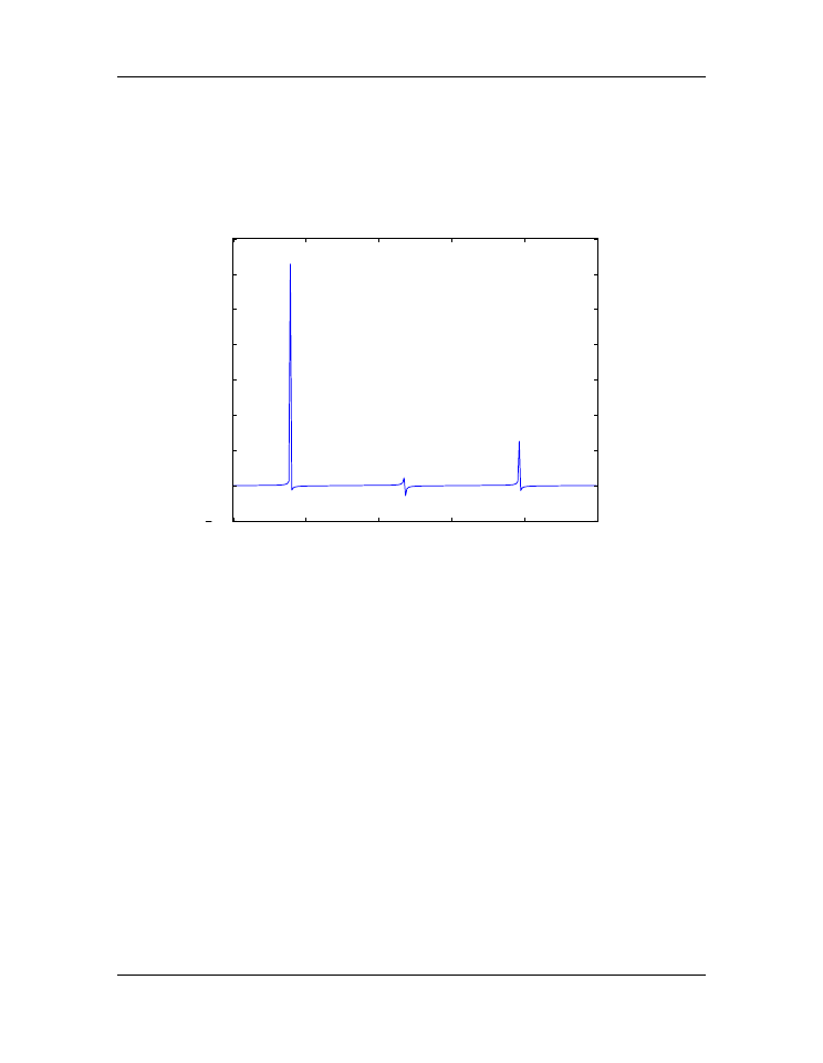
The resulting plot, shown above, doesn’t quite look like what you might have expected
for
tan
θ
vs
θ
. The problem is that
tan
θ
diverges at
θ
=
π/
2
,
3
π/
2
,
5
π/
2
, ...
, which
leads to large spikes in the plots as values in the
theta
array come near those values.
Of course, we don’t want the plot to extend all the way out to
±∞
in the
y
direction, nor
can it. Instead, we would like the plot to extend far enough that we get the idea of what is
going on as
y
→ ±∞
, but we would still like to see the behavior of the graph near
y
= 0
.
We can restrict the range of
ytan
values that are plotted using the MatPlotLib function
ylim
, as we demonstrate in the script below.
import
numpy
as
np
import
matplotlib.pyplot
as
plt
theta
=
np
.
arange(
0.01
,
10.
,
0.04
)
ytan
=
np
.
tan(theta)
plt
.
figure()
plt
.
plot(theta, ytan)
plt
.
ylim(
-
8
,
8
)
# restricts range of y axis from -8 to +8
plt
.
axhline(color
=
"gray"
, zorder
=-
1
)
84
Chapter 5. Plotting