ВУЗ: Не указан
Категория: Не указан
Дисциплина: Не указана
Добавлен: 17.04.2021
Просмотров: 3738
Скачиваний: 3
Introduction to Python for Science, Release 0.9.23
plt
.
show()
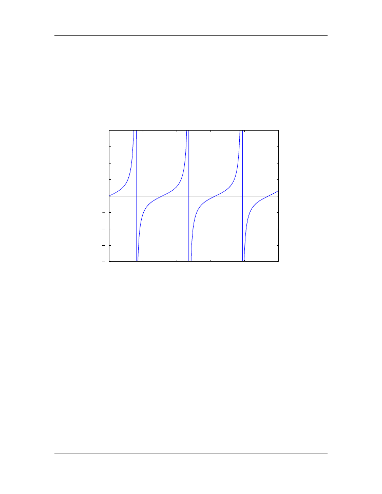
The figure produced by this script is shown below. The plot now looks much more like
the familiar
tan
θ
function we know. We have also include a call to the
axline
function
to create an
x
axis.
0
2
4
6
8
10
8
6
4
2
0
2
4
6
8
Figure 5.6: Tangent function (with spurious lines)
The vertical blue lines at
θ
=
π/
2
,
3
π/
2
,
5
π/
2
should not appear in a plot of
tan
θ
vs
θ
. However, they do appear because the
plot
function simply draws lines between the
data points in the
x
-
y
arrays provided in its arguments. Thus,
plot
draws a line between
the very large positive and negative
ytan
values corresponding to the
theta
values on
either side of
π/
2
where
tan
θ
diverges to
±∞
. It would be nice to exclude that line.
Masked arrays
We can exclude the data points near
θ
=
π/
2
,
3
π/
2
,
5
π/
2
in the above plot, and thus
avoid drawing the nearly vertical lines at those points, using NumPy’s
masked array
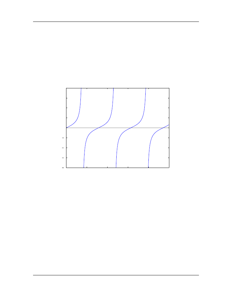
feature. The code below shows how this is done and produces the graph below. The
masked array feature is implemented in line 6 with a call to NumPy’s
masked_where
function in the sub-module
ma
(masked array).
Therefore, it is called by writing
5.2. Basic plotting
85
Introduction to Python for Science, Release 0.9.23
np.ma.masked_where
. The
masked_where
function works as follows. The first
argument sets the condition for masking elements of the array, which is specified by the
second argument. In this case, the function says to mask all elements of the array
ytan
(the second argument) where the absolute value of
ytan
is greater than 20. The result
is set equal to
ytanM
. When
ytanM
is plotted, MatPlotLib’s
plot
function omits all
masked points from the plot. You can think of it as the
plot
function lifting the pen that
is drawing the line in the plot when it comes to the masked points in the array
ytanM
.
0
2
4
6
8
10
8
6
4
2
0
2
4
6
8
Figure 5.7: Tangent function
1
import
numpy
as
np
2
import
matplotlib.pyplot
as
plt
3
4
theta
=
np
.
arange(
0.01
,
10.
,
0.04
)
5
ytan
=
np
.
tan(theta)
6
ytanM
=
np
.
ma
.
masked_where(np
.
abs(ytan)
>
20.
, ytan)
7
8
plt
.
figure()
9
plt
.
plot(theta, ytanM)
10
plt
.
ylim(
-
8
,
8
)
11
plt
.
axhline(color
=
"gray"
, zorder
=-
1
)
12
13
plt
.
show()
86
Chapter 5. Plotting

Introduction to Python for Science, Release 0.9.23
5.2.4 Subplots
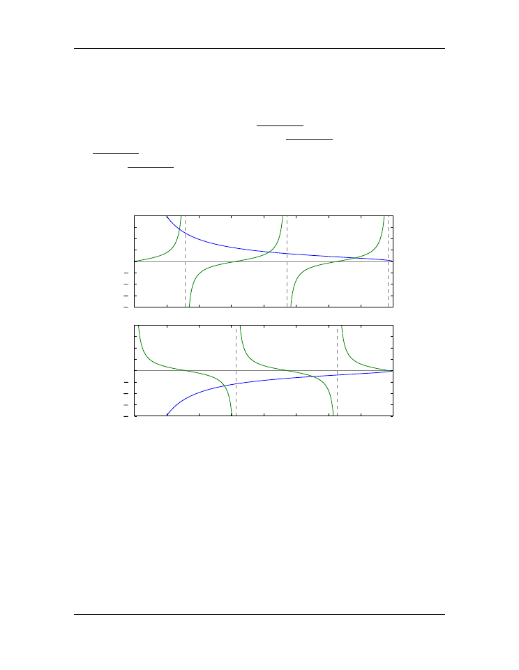
Often you want to create two or more graphs and place them next to one another, generally
because they are related to each other in some way. The plot below shows an example of
such a plot. In the top graph,
tan
θ
and
p
(8
/θ
)
2
−
1
vs
θ
are plotted. The two curves
cross each other at the points where
tan
θ
=
p
(8
/θ
)
2
−
1
. In the bottom
cot
θ
and
−
p
(8
/θ
)
2
−
1
vs
θ
are plotted. These two curves cross each other at the points where
cot
θ
=
−
p
(8
/θ
)
2
−
1
.
0
1
2
3
4
5
6
7
8
theta
8
6
4
2
0
2
4
6
8
tan(theta)
0
1
2
3
4
5
6
7
8
theta
8
6
4
2
0
2
4
6
8
cot(theta)
Figure 5.8: Crossing functions
The code that produces this plot is provided below.
1
import
numpy
as
np
2
import
matplotlib.pyplot
as
plt
3
4
theta
=
np
.
arange(
0.01
,
8.
,
0.04
)
5
y
=
np
.
sqrt((
8.
/
theta)
**
2
-
1.
)
6
ytan
=
np
.
tan(theta)
7
ytan
=
np
.
ma
.
masked_where(np
.
abs(ytan)
>
20.
, ytan)
8
ycot
=
1.
/
np
.
tan(theta)
5.2. Basic plotting
87

Introduction to Python for Science, Release 0.9.23
9
ycot
=
np
.
ma
.
masked_where(np
.
abs(ycot)
>
20.
, ycot)
10
11
plt
.
figure(
1
)
12
13
plt
.
subplot(
2
,
1
,
1
)
14
plt
.
plot(theta, y)
15
plt
.
plot(theta, ytan)
16
plt
.
ylim(
-
8
,
8
)
17
plt
.
axhline(color
=
"gray"
, zorder
=-
1
)
18
plt
.
axvline(x
=
np
.
pi
/
2.
, color
=
"gray"
, linestyle
=
’--’
, zorder
=-
1
)
19
plt
.
axvline(x
=
3.
*
np
.
pi
/
2.
, color
=
"gray"
, linestyle
=
’--’
, zorder
=-
1
)
20
plt
.
axvline(x
=
5.
*
np
.
pi
/
2.
, color
=
"gray"
, linestyle
=
’--’
, zorder
=-
1
)
21
plt
.
xlabel(
"theta"
)
22
plt
.
ylabel(
"tan(theta)"
)
23
24
plt
.
subplot(
2
,
1
,
2
)
25
plt
.
plot(theta,
-
y)
26
plt
.
plot(theta, ycot)
27
plt
.
ylim(
-
8
,
8
)
28
plt
.
axhline(color
=
"gray"
, zorder
=-
1
)
29
plt
.
axvline(x
=
np
.
pi, color
=
"gray"
, linestyle
=
’--’
, zorder
=-
1
)
30
plt
.
axvline(x
=
2.
*
np
.
pi, color
=
"gray"
, linestyle
=
’--’
, zorder
=-
1
)
31
plt
.
xlabel(
"theta"
)
32
plt
.
ylabel(
"cot(theta)"
)
33
34
plt
.
show()
The function
subplot
, called on lines 13 and 24, creates the two subplots in the above
figure.
subplot
has three arguments. The first specifies the number of rows that the
figure space is to be divided into; on line 13, it’s two. The second specifies the number
of columns that the figure space is to be divided into; on line 13, it’s one. The third
argument specifies which rectangle the will contain the plot specified by the following
function calls. Line 13 specifies that the plotting commands that follow will be act on
the first box. Line 24 specifies that the plotting commands that follow will be act on the
second box.
We have also labeled the axes and included dashed vertical lines at the values of
θ
where
tan
θ
and
cot
θ
diverge.
88
Chapter 5. Plotting
Introduction to Python for Science, Release 0.9.23
5.3 Logarithmic plots
Data sets can span many orders of magnitude from fractional quantities much smaller
than unity to values much larger than unity. In such cases it is often useful to plot the data
on logarithmic axes.
5.3.1 Semi-log plots
For data sets that vary exponentially in the independent variable, it is often useful to use
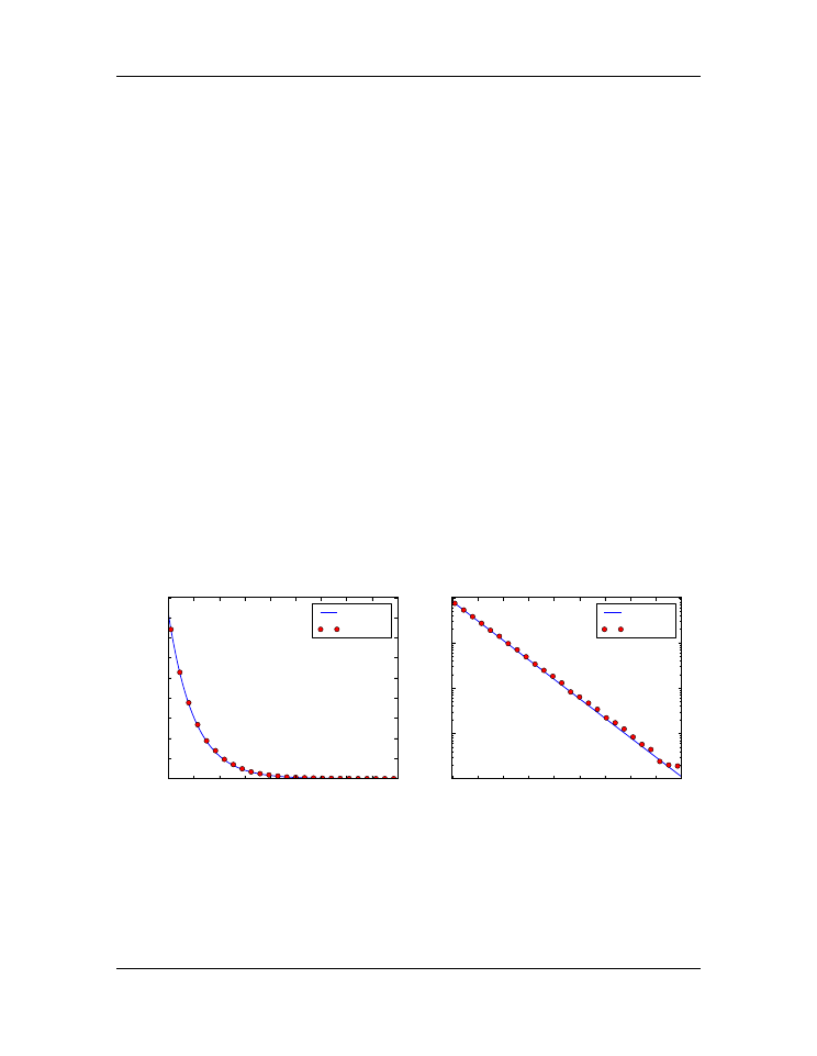
one or more logarithmic axes. Radioactive decay of unstable nuclei, for example, exhibits
an exponential decrease in the number of particles emitted from the nuclei as a function
of time. In the plot below, for example, we show the decay of the radioactive isotope
Phosphorus-32 over a period of 6 months, where the radioactivity is measured once each
week. Starting at a decay rate of nearly
10
4
electrons (counts) per second, the decay rate
diminishes to only about 1 count per second after about 6 months or 180 days. If we plot
counts per second as a function of time on a normal plot, as we have done in the plot on
the left below, then the count rate is indistinguishable from zero after about 100 days. On
the other hand, if we use a logarithmic axis for the count rate, as we have done in the plot
on the right below, then we can follow the count rate well past 100 days and can readily
distinguish it from zero. Moreover, if the data vary exponentially in time, then the data
will fall along a straight line, as they do for the case of radioactive decay.
0 20 40 60 80 100 120 140 160 180
time (days)
0
1000
2000
3000
4000
5000
6000
7000
8000
9000
counts per second
theory
data
0 20 40 60 80 100 120 140 160 180
time (days)
10
0
10
1
10
2
10
3
10
4
counts per second
theory
data
Figure 5.9: Semi-log plotting
MatPlotLib provides two functions for making semi-logarithmic plots,
semilogx
and
semilogy
, for creating plots with logarithmic
x
and
y
axes, with linear
y
and
x
axes,
respectively. We illustrate their use in the program below, which made the above plots.
5.3. Logarithmic plots
89