ВУЗ: Не указан
Категория: Не указан
Дисциплина: Не указана
Добавлен: 17.04.2021
Просмотров: 3748
Скачиваний: 3

Introduction to Python for Science, Release 0.9.23
1
import
numpy
as
np
2
import
matplotlib.pyplot
as
plt
3
4
# read data from file
5
time, counts, unc
=
np
.
loadtxt(
’SemilogDemo.txt’
, unpack
=
True
)
6
7
# create theoretical fitting curve
8
tau
=
20.2
# Phosphorus-32 half life = 14 days; tau = t_half/ln(2)
9
N0
=
8200.
# Initial count rate (per second)
10
t
=
np
.
linspace(
0
,
180
,
128
)
11
N
=
N0
*
np
.
exp(
-
t
/
tau)
12
13
# create plot
14
plt
.
figure(
1
, figsize
=
(
10
,
4
) )
15
16
plt
.
subplot(
1
,
2
,
1
)
17
plt
.
plot(t, N,
’b-’
, label
=
"theory"
)
18
plt
.
plot(time, counts,
’ro’
, label
=
"data"
)
19
plt
.
xlabel(
’time (days)’
)
20
plt
.
ylabel(
’counts per second’
)
21
plt
.
legend(loc
=
’upper right’
)
22
23
plt
.
subplot(
1
,
2
,
2
)
24
plt
.
semilogy(t, N,
’b-’
, label
=
"theory"
)
25
plt
.
semilogy(time, counts,
’ro’
, label
=
"data"
)
26
plt
.
xlabel(
’time (days)’
)
27
plt
.
ylabel(
’counts per second’
)
28
plt
.
legend(loc
=
’upper right’
)
29
30
plt
.
tight_layout()
31
32
# display plot on screen
33
plt
.
show()
The
semilogx
and
semilogy
functions work the same way as the
plot
function.
You just use one or the other depending on which axis you want to be logarithmic.
The
tight_layout()
function
You may have noticed the
tight_layout()
function, called without arguments on
line 30 of the program. This is a convenience function that adjusts the sizes of the plots to
make room for the axes labels. If it is not called, the
y
-axis label of the right plot runs into
the left plot. The
tight_layout()
function can also be useful in graphics windows
90
Chapter 5. Plotting

Introduction to Python for Science, Release 0.9.23
with only one plot sometimes.
5.3.2 Log-log plots
MatPlotLib can also make log-log or double-logarithmic plots using the function
loglog
. It is useful when both the
x
and
y
data span many orders of magnitude. Data
that are described by a power law
y
=
Ax
b
, where
A
and
b
are constants, appear as
straight lines when plotted on a log-log plot. Again, the
loglog
function works just like
the
plot
function but with logarithmic axes.
5.4 More advanced graphical output
The plotting methods introduced in the previous sections are perfectly adequate for basic
plotting and are therefore recommended for simple graphical output. Here, we introduce
an alternative syntax that harnesses the full power of MatPlotLib. It gives the user more
options and greater control. Perhaps the most efficient way to learn this alternative syntax
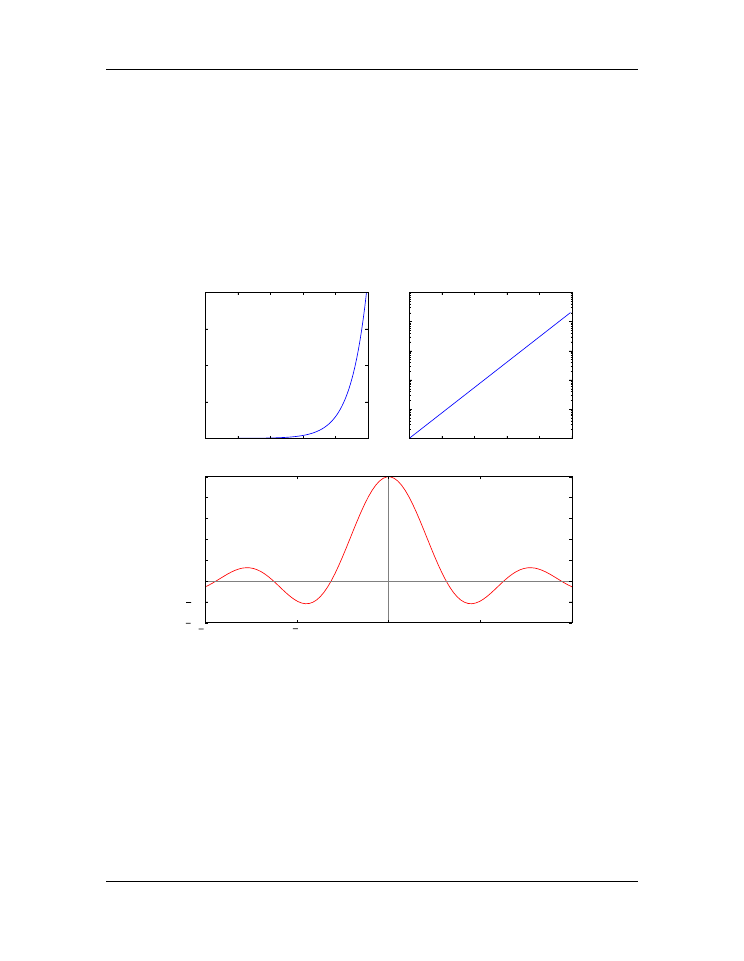
is to look at an example. The figure below illustrating
Mulitple plots in the same window
is produced by the following code:
1
# Demonstrates the following:
2
#
plotting logarithmic axes
3
#
user-defined functions
4
#
"where" function, NumPy array conditional
5
6
import
numpy
as
np
7
import
matplotlib.pyplot
as
plt
8
9
# Define the sinc function, with output for x=0 defined
10
# as a special case to avoid division by zero
11
def
s
(x):
12
a
=
np
.
where(x
==
0.
,
1.
, np
.
sin(x)
/
x)
13
return
a
14
15
# create arrays for plotting
16
x
=
np
.
arange(
0.
,
10.
,
0.1
)
17
y
=
np
.
exp(x)
18
19
t
=
np
.
linspace(
-
10.
,
10.
,
100
)
20
z
=
s(t)
21
22
# create a figure window
5.4. More advanced graphical output
91

Introduction to Python for Science, Release 0.9.23
0
2
4
6
8
10
time (ms)
0
5000
10000
15000
20000
distance (mm)
exponential
0
2
4
6
8
10
time (ms)
10
0
10
1
10
2
10
3
10
4
10
5
distance (mm)
exponential
10
5
0
5
10
angle (deg)
0.4
0.2
0.0
0.2
0.4
0.6
0.8
1.0
electric field
sinc function
Figure 5.10: Mulitple plots in the same window
92
Chapter 5. Plotting

Introduction to Python for Science, Release 0.9.23
23
fig
=
plt
.
figure(
1
, figsize
=
(
9
,
8
))
24
25
# subplot: linear plot of exponential
26
ax1
=
fig
.
add_subplot(
2
,
2
,
1
)
27
ax1
.
plot(x, y)
28
ax1
.
set_xlabel(
’time (ms)’
)
29
ax1
.
set_ylabel(
’distance (mm)’
)
30
ax1
.
set_title(
’exponential’
)
31
32
# subplot: semi-log plot of exponential
33
ax2
=
fig
.
add_subplot(
2
,
2
,
2
)
34
ax2
.
plot(x, y)
35
ax2
.
set_yscale(
’log’
)
36
ax2
.
set_xlabel(
’time (ms)’
)
37
ax2
.
set_ylabel(
’distance (mm)’
)
38
ax2
.
set_title(
’exponential’
)
39
40
# subplot: wide subplot of sinc function
41
ax3
=
fig
.
add_subplot(
2
,
1
,
2
)
42
ax3
.
plot(t, z,
’r’
)
43
ax3
.
axhline(color
=
’gray’
)
44
ax3
.
axvline(color
=
’gray’
)
45
ax3
.
set_xlabel(
’angle (deg)’
)
46
ax3
.
set_ylabel(
’electric field’
)
47
ax3
.
set_title(
’sinc function’
)
48
49
# Adjusts white space to avoid collisions between subplots
50
fig
.
tight_layout()
51
plt
.
show()
After defining several arrays for plotting, the above program opens a figure window in
line 23 with the statement
fig
=
plt
.
figure(figsize
=
(
9
,
8
))
The MatPlotLib statement above creates a
Figure
object, assigns it the name
fig
, and
opens a blank figure window. Thus, just as we give lists, arrays, and numbers variable
names (
e.g.
a = [1, 2, 5, 7]
,
dd = np.array([2.3, 5.1, 3.9])
, or
st
= 4.3
), we can give a figure object and the window in creates a name: here it is
fig
.
In fact we can use the
figure
function to open up multiple figure objects with different
figure windows. The statements
fig1
=
plt
.
figure()
fig2
=
plt
.
figure()
5.4. More advanced graphical output
93

Introduction to Python for Science, Release 0.9.23
open up two separate windows, one named
fig1
and the other
fig2
. We can then use the
names
fig1
and
fig2
to plot things in either window. The
figure
function need not
take any arguments if you are satisfied with the default settings such as the figure size and
the background color. On the other hane, by supplying one or more keyword arguments,
you can customize the figure size, the background color, and a few other properties. For
example, in the program listing (line 23), the keyword argument
figsize
sets the width
and height of the figure window; the default size is
(8, 6)
; in our program we set it to
(9, 8)
, which is a bit wider and higher than the default size. In the example above, we
also choose to open only a single window, hence the single
figure
call.
The
fig.add_subplot(2,2,1)
in line 30 is a MatPlotLib function that divides the
figure window into 2 rows (the first argument) and 2 columns (the second argument). The
third argument creates a subplot in the first of the 4 subregions (
i.e.
of the 2 rows
×
2
columns) created by the
fig.add_subplot(2,2,1)
call. To see how this works,
type the following code into a Python module and run it:
1
import
numpy
as
np
2
import
matplotlib.pyplot
as
plt
3
4
fig
=
plt
.
figure(figsize
=
(
9
,
8
))
5
ax1
=
fig
.
add_subplot(
2
,
2
,
1
)
6
7
plt
.
show()
You should get a figure window with axes drawn in the upper left quadrant.
The
fig.
prefix used with the
add_subplot(2,2,1)
function directs Python to draw
these axes in the figure window named
fig
. If we had opened two figure windows,
changing the prefix to correspond to the name of one or the other of the figure win-
dows would direct the axes to be drawn in the appropriate window. Writing
ax1 =
fig.add_subplot(2,2,1)
assigns the name ax1 to the axes in the upper left quad-
rant of the figure window.
The
ax1.plot(x, y)
in line 27 directs Python to plot the previously-defined
x
and
y
arrays onto the axes named
ax1
. The
ax2 = fig.add_subplot(2,2,2)
draws axes in the second, or upper right, quadrant of the figure window. The
ax3 =
fig.add_subplot(2,1,2)
divides the figure window into 2 rows (first argument)
and 1 column (second argument), creates axes in the second or these two sections, and
assigns those axes (
i.e.
that subplot) the name
ax3
. That is, it divides the figure win-
dow into 2 halves, top and bottom, and then draws axes in the half number 2 (the third
argument), or lower half of the figure window.
You may have noticed in above code that some of the function calls are a bit different
from those used before:
xlabel(’time (ms)’)
becomes
set_xlabel(’time
(ms)’)
,
title(’exponential’)
becomes
set_title(’exponential’)
,
94
Chapter 5. Plotting